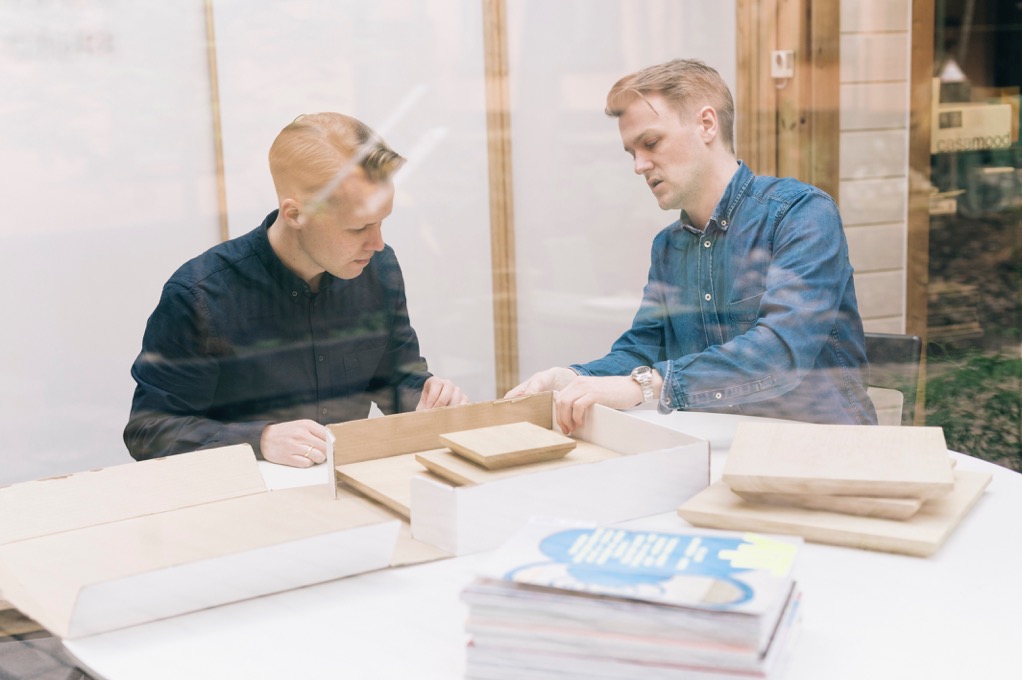
How Heydays gets things done
Heydays is a Norwegian design agency based in Oslo.
Originally founded by a group of design school peers, the multidisciplinary team at Heydays produces thoughtful work for international clients including iconography for Pebble Smartwatches, interactive signage for Norwegian concert hall Fosnavåg, and the soon-to-be-released adaptive identity for Oslo City Bike. We caught up with co-founder Mathias Haddal Hovet to chat about starting a design business, creative process, and finding unexpected inspiration in hula hoops.
Tell me a little about Heydays. How did the company get started?
Heydays was founded in 2008 straight out of school. Our five founding partners went to the same graphic design school here in Oslo. During our school years we became good friends and also found a good creative chemistry between us to solve school projects. During the last year we landed some clients on our own, one of them a Scandinavian hip hop and R&B magazine we got the art direction responsibility for, called Kingsize. A couple of months working like this, and school coming to an end, we started looking for a studio space we could share in Oslo. Things escalated and we decided that we wanted to spend our savings from client work after school to found our own company.
I was happy to see you are based in Oslo. I visited Norway last year and absolutely fell in love with it. How does your location impact your work?
Oslo gets a lot of positive attention these days, and I guess the spotlight for Scandinavian design has shifted from Copenhagen and Stockholm to Oslo for a while — which we of course welcome! It’s hard to look at yourself from the outside, in terms of how our location impacts our work. We’ve always tried to look outside of Norway when searching for inspiration. At the same time we’re always looking for rational, simple and functional ideas in our projects — so I guess that’s kind typical Scandinavian somehow.
What inspires your team?
First of all, a great challenge and passionate clients. An interesting brief, meeting people with ambitions and a desire to collaborate. Besides that we’re quite different in terms of what we do on our spare time. Skiing, bike riding, travelling or walking the dog. Usual stuff. We try to keep hours on a normal 40 hours a week, which is pretty standard here. You go empty if you have to be at your desk at all time.

“It makes a very good starting point for design work when you have your brand story straight first.”
What does your team’s creative process look like?
We really like to focus on spending enough time understanding our clients vision and challenges they’re facing. Insight workshops, asking all the stupid questions, challenging our clients and then start distilling a debrief is really helpful. Sometimes frustrating, but it makes a very good starting point for design work when you have your brand story straight first. It’s helpful both internally and externally for a client, to have someone help them define a narrative which is a lot more vocal than a business plan.
After this we start the visual work. Various directions, sketches and prototypes. Dropmark, as we’ve been using it for years now, makes it really easy to gather all the lose ends early in the process. We try to keep a nice combination of both sketching on relevant touch-points and a lot more far-out stuff, just to give them an idea on where this might go. We do both digital and print work and also have our own developers and motion graphic guy. For a such a small agency its really powerful to be able to do both the strategic design work and so much of the final implementation.
How does Dropmark fit into your workflow?
We use Dropmark on almost every project. We use it for internal collaboration throughout a project to gather insight, inspiration and details that might influence an identity or web product. Words, phrases, and concepts are summarised in text notes and images, videos, and web links are all gathered in the same folder.
If working with an external team we share our visual input with them, so they get an easy and early access showing them in which direction we’re moving. In early stage client meetings we also use Dropmark as a moodboard, where everything from sounds, to fonts to material samples are gathered in a shared space.
What’s the most interesting thing you’ve Dropmarked recently?
Actually, a video of two persons hula hooping — a really beautiful and weird promotional video shot for the fashion brand COS, made by the amazing Lernert & Sander.
For more on Heydays visit heydays.no and follow @heydaysoslo on Twitter.
