Reverse Engineered: Matheson Food Company
Ever seen a brand and thought, I wish I could make something like that? Us too! That’s why we’re peeling back the layers of our favorite brands to uncover what makes them stand out—and using Dropmark to turn them into creative inspiration fuel.
By breaking down brands into their key elements, we can see how the cake is made and return to these collections of inspiration for future projects. It also doubles as a creative exercise if you’re feeling stuck. Working on inspiration this way takes the pressure off yourself. It allows you to explore what makes designs resonate with you instead of forcing gold from your pen when the ink feels dry. If this idea sounds familiar, it comes from practice in design school when you collect layouts or websites and similarly break them down into separate components. For our first foray into this series, we decided to work on Matheson Food Company by Wedge.
Matheson Food Company is a pantry staple supplier, born into existence by Matty Matheson. Matty is a chef, restaurateur, and Emmy-nominated executive producer of The Bear. The gregarious chef has always been a favorite of ours; his personality is as prominent as his flavors, and we were excited to see that the packaging for Matheson Food Company matched. Some things that stuck out to us were the bright primary colors and the nostalgic packaging that permeates his brand. Matheson Food Company makes a good start to our series as it utilizes some popular design trends, like heavy use of typography with a minimal aesthetic. We liked how this packaging utilizes bold type but feels like a standout compared to other modern brands.

The breakdown:
-
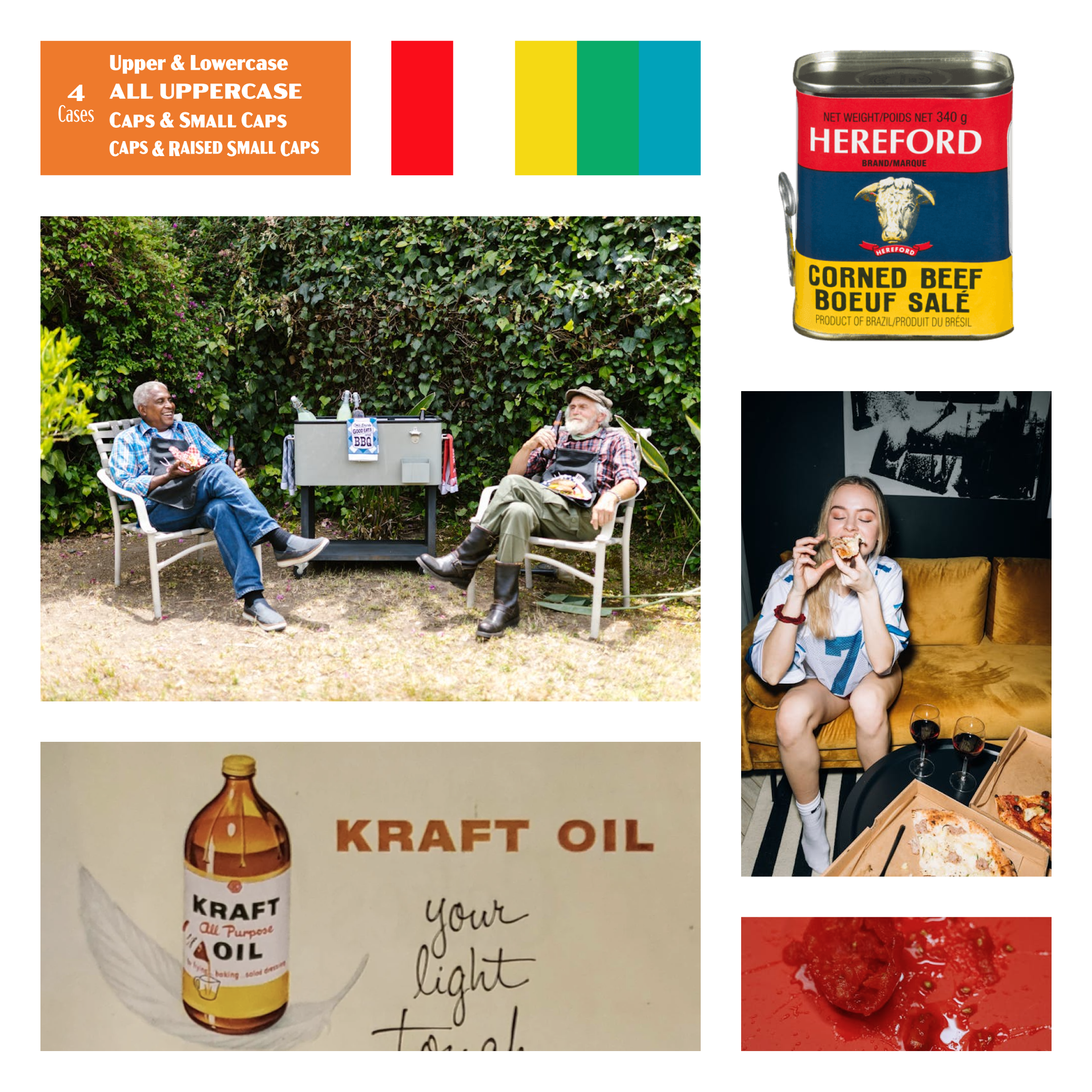
Color Palette: The bright primary colors are eye-catching, particularly the big glowing red that they use as a primary color on the website. Although the brand color palette is relatively simple, that’s precisely what makes it stand out in a sea of competitors with more complex palettes.
-
Typography: The fonts used are a medium-contrast sans serif. This type of font is a call back to the packaging of corned beef that Matty loved and grew up on. The choice of type for Matheson Food Company reinforces the brand identity as a nostalgic, heritage-type brand. Still, it is also inextricably linked to the man behind the products.
-
Imagery: The imagery used for the packaging calls back to the first commercially available food packaging of the 30s. Additionally, the use of photography on the website is full of bright, saturated colors with candid subjects. The themes feel very approachable, as if you have taken photos at a family get together with a disposable camera.
-
Packaging & Layouts: Part of the reason for choosing a retro direction with the brand, according to Wedge, was to align with Matty’s past and position it as a brand with longevity. Through these choices, the design studio hopes to create a brand that outlives the nostalgia trend cycle.
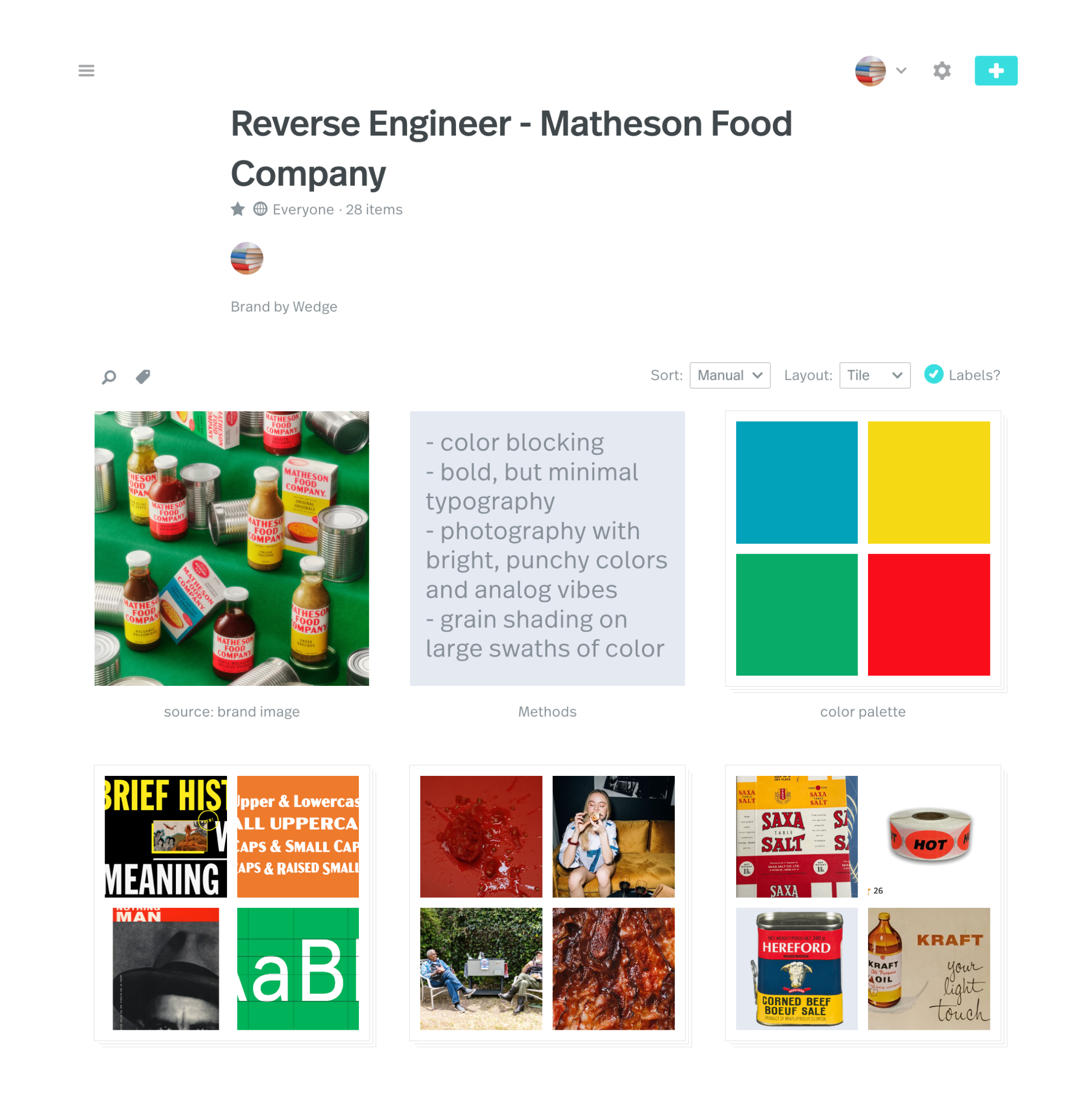
With all these things in mind, we collected inspiration based on the brand, Matheson Food Company. We organized the collection by placing each component into stacks and writing a breakdown of the brand in a note. If this type of project inspires you, we encourage you to make your own! Simple takeaways are to analyze colors, fonts, and imagery from brands you love and experiment with these elements in your work.
We hope you enjoyed our dissection of the brand Matheson Food Company and its bright primary colors mixed with good vibes and nostalgia. Take a look at our collection to explore further, or get started on your own! Let us know if you’ve got a suggestion for who we should reverse engineer next!

