Reverse Engineered - Brooklyn Museum
Ever seen a brand and thought, I wish I could make something like that? Us too! That’s why we’re peeling back the layers of our favorite brands to uncover what makes them stand out—and using Dropmark to turn them into creative inspiration fuel.
By breaking down brands into their key elements, we can see how the cake is made and return to these collections of inspiration for future projects. It also doubles as a creative exercise if you’re feeling stuck. Working on inspiration this way takes the pressure off yourself. It allows you to explore what makes designs resonate with you instead of forcing gold from your pen when the ink feels dry. If this idea sounds familiar, it comes from practice in design school when you collect layouts or websites and similarly break them down into separate components. For our next brand in this series, we decided to work on the brand update for the Brooklyn Museum, a collaboration between the in-house team and studio Other Means.
The Brooklyn Museum has long been a leading cultural establishment since opening its doors in 1824. As Brooklyn’s first free, circulating library, it played a significant role in Brooklyn’s intellectual and artistic development, eventually placing greater focus on arts and sciences, leading to the creation of the museum. No stranger to reinvention and on the tail of its 200th birthday, the Brooklyn Museum set out to reinvent once again.
In partnership with Other Means, the new brand refresh for the Brooklyn Museum aims to honor the institution’s rich history while embracing a modern and dynamic future. Drawing inspiration from its evolution, architecturally and culturally, the new brand celebrates the museum’s commitment to evolving with its community while staying true to its foundational mission of celebrating art and culture.

The breakdown:
-
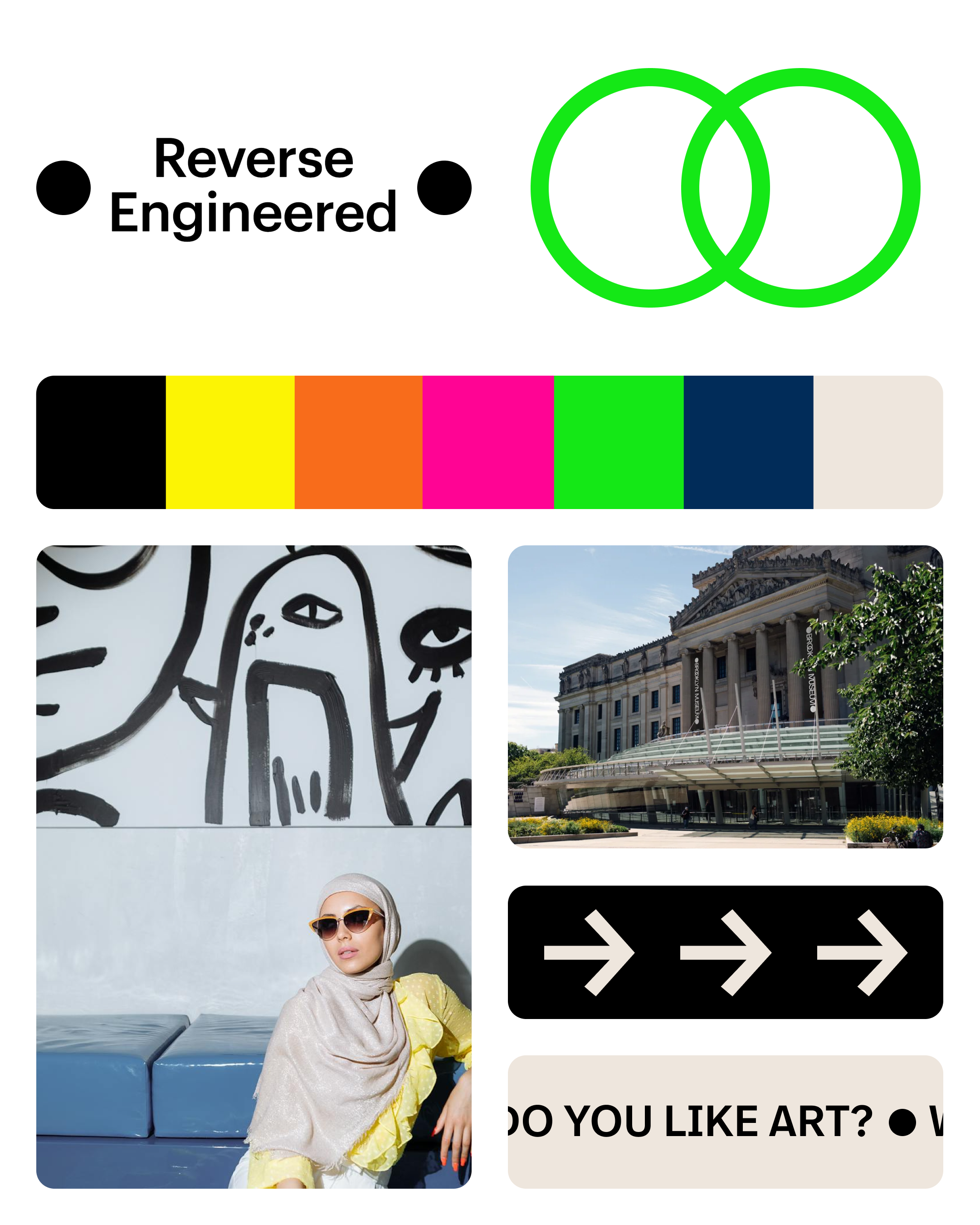
Color Palette: Shades of gray mimic the physicality of the space with bight punchy accent colors paying homage to Brooklyn itself
-
Typography: Intertwined typographic ligatures on a modern sans serif typeface reflect the museumsmultidimensionality.
-
UI/UX:Soft rounded UI and bento box grid add a trendy, friendly, and welcoming landing page for visitors to the site.
-
Graphical elements: Architecturally informed brand design incorporates elements of the physical location and neoclassical roots. For example, the dot graphical treatment on logo mimics statues outside of the museum.
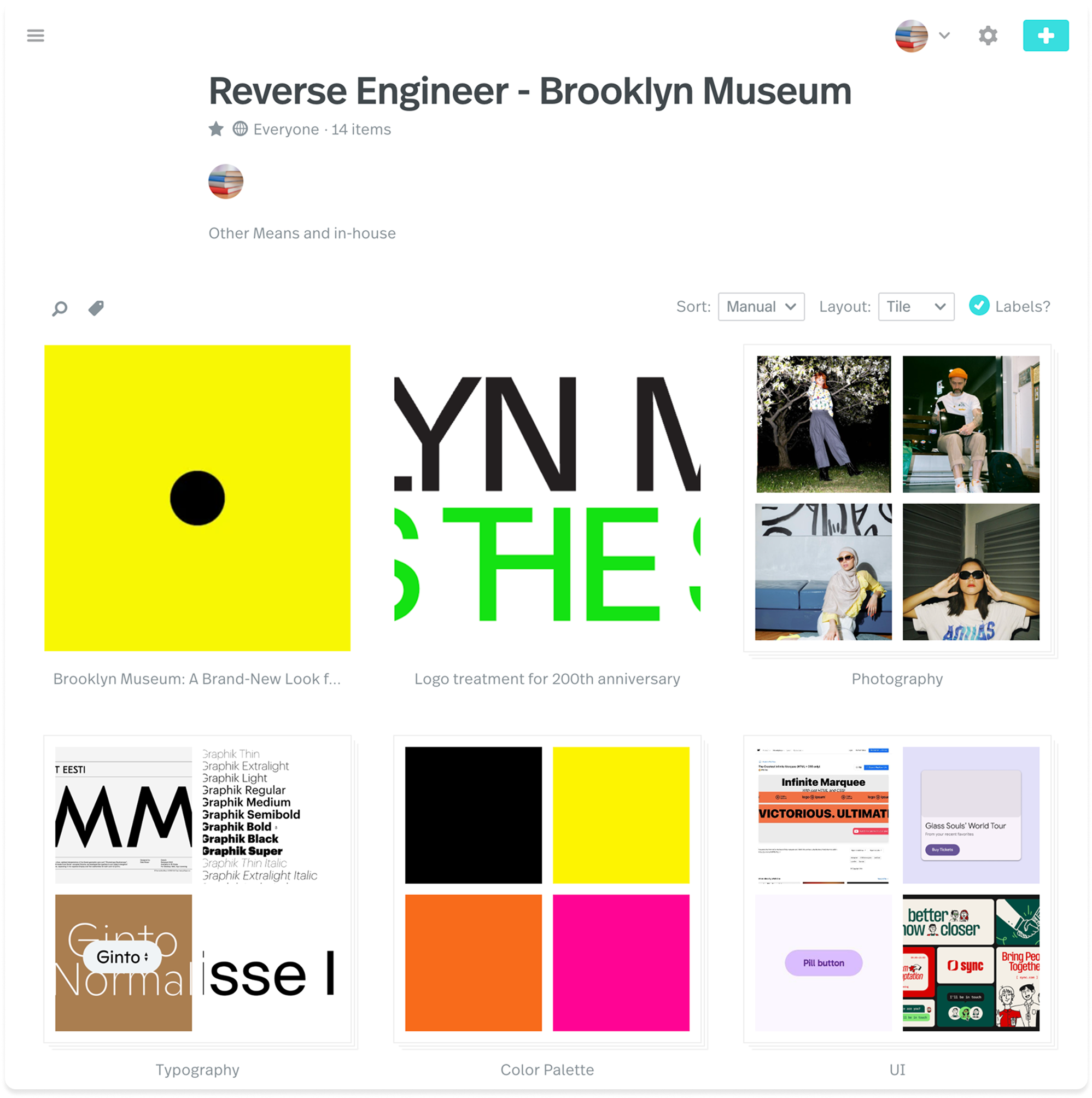
With all these things in mind, and only just scratching the surface, we collected inspiration based on the identity forBrooklyn Museum. We organized the collection by placing each component into stacks and writing a breakdown of the brand in a note.
If this type of project inspires you, we encourage you to make your own! Simple takeaways are to analyze colors, fonts, and imagery from brands you love and experiment with these elements in your work.
We hope you enjoyed our dissection of the brand and its innovative look at historical references mixed with warmth and a forward momentum mindset. Take a look at our collection to explore further, or get started on your own! Let us know if you’ve got a suggestion for who we should reverse engineer next!

