Reverse Engineered: New York Botanical Garden
Ever seen a brand and thought, I wish I could make something like that? Us too! That’s why we’re peeling back the layers of our favorite brands to uncover what makes them stand out—and using Dropmark to turn them into creative inspiration fuel.
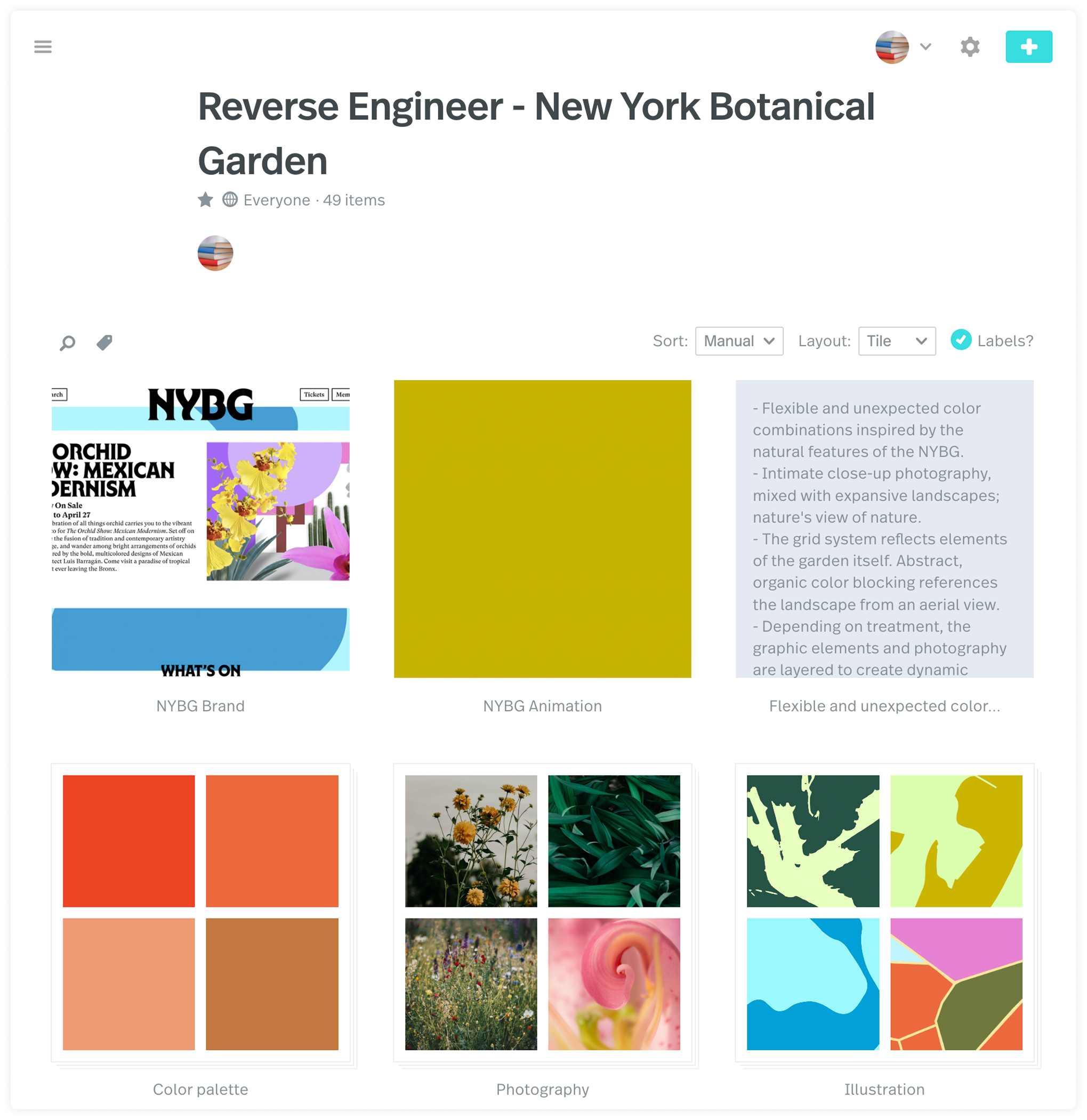
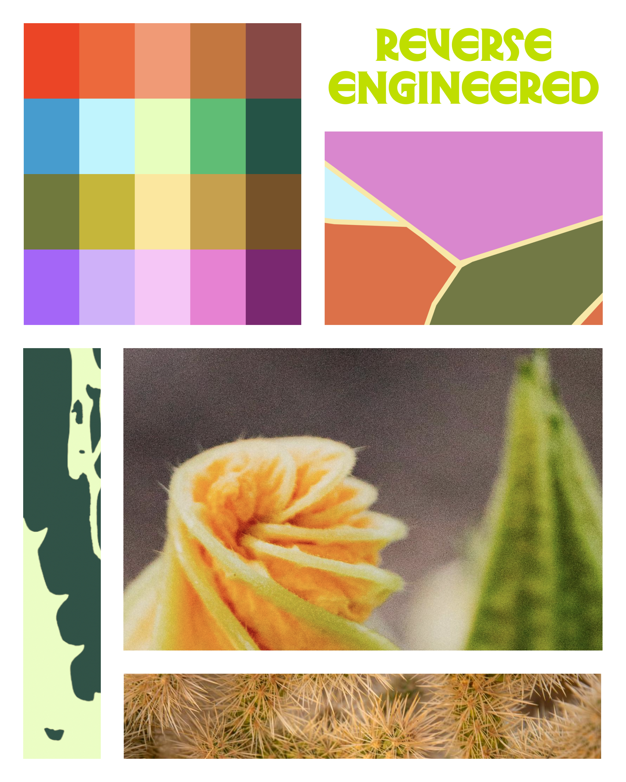
By breaking down brands into their key elements, we can see how the cake is made and return to these collections of inspiration for future projects. It also doubles as a creative exercise if you’re feeling stuck. Working on inspiration this way takes the pressure off yourself. It allows you to explore what makes designs resonate with you instead of forcing gold from your pen when the ink feels dry. If this idea sounds familiar, it comes from practice in design school when you collect layouts or websites and similarly break them down into separate components. For our next brand this series, we decided to work on the New York Botanical Garden by Wolff Olins.
Established in 1891, the New York Botanical Garden is a leading center for botanical research, conservation, and education. This 250 acre oasis hosts seasonal exhibits and features lush gardens, historic glasshouses, and diverse plant collections. It is not only a beautiful place for New Yorkers and tourists to visit, but is also a globally significant institution. With all of these things in mind, Wolff Olins worked with NYBG to create a brand refresh that not only highlights the vibrancy of plant life, but also the people involved. We were very excited to break this project down as you can truly see aspects of the garden in every piece of the project, from the expansive color palette to the grid system that references the historic conservatories on the property. We were particularly excited to see the shape of leaves mimicked in the custom typography and the abstract colorful patterns that showcase the beauty of the garden grounds as seen from an aerial view.
The breakdown:
-
Color Palette: A flexible and unexpected combination of colors are inspired by the natural features of the NYBG, giving viewers a glimpse at the rich flora and fauna.
-
Typography: Custom type by Ryan Bugden incorporates forms often found in nature as well as New York City itself. GT Superis used as a secondary typeface to further the concept of retrospective but forward thinking. The final typeface, Martian Mono, evokes botanical reference cards.
-
Imagery: Intimate close-up photography mixed with expansive landscapes evoke the idea of nature from nature’s perspective. Alongside abstract color blocking that references the garden’s landscape from an aerial view, elements are layered to create dynamic visuals.
-
Grid system: The grid for the project mimics panes of glass from the iconic conservatories on the grounds.
With all these things in mind, and only just scratching the surface, we collected inspiration based on the identity for NYBG. We organized the collection by placing each component into stacks and writing a breakdown of the brand in a note. If this type of project inspires you, we encourage you to make your own! Simple takeaways are to analyze colors, fonts, and imagery from brands you love and experiment with these elements in your work.
We hope you enjoyed our dissection of the brand and its innovative look at historical references mixed with warmth and a forward momentum mindset. Take a look at our collection to explore further, or get started on your own! Let us know if you’ve got a suggestion for who we should reverse engineer next!