Some designers fall in love with color, others with layout. But for Alessia, it was always type. Even as a graphic design student, she found herself drawn to the parts of a project that involved letterforms. Eventually, a realization clicked into place: she didn’t just want to choose typefaces. She wanted to draw them.
Type design offered the perfect blend of structure and intuition. “It’s about defining a system and an underlying logic,” she explains, “while leaving space for small surprises and specific, original details.” That duality of precision paired with humanity runs throughout her work.
Growing up in Italy meant being surrounded by a vivid typographic landscape: hand-painted shop signs, solemn cemetery inscriptions, pragmatic municipal wayfinding, and spatterings of expressive lettering. The coexistence of the formal and quirky, carefully planned and the charmingly imperfect, shaped the way she reads and interprets visual language. “I’m interested in how letterforms behave as a system,” she says, “but also in the local deviations that make them feel human.”
A process built on gesture, structure, and trying things in the wild
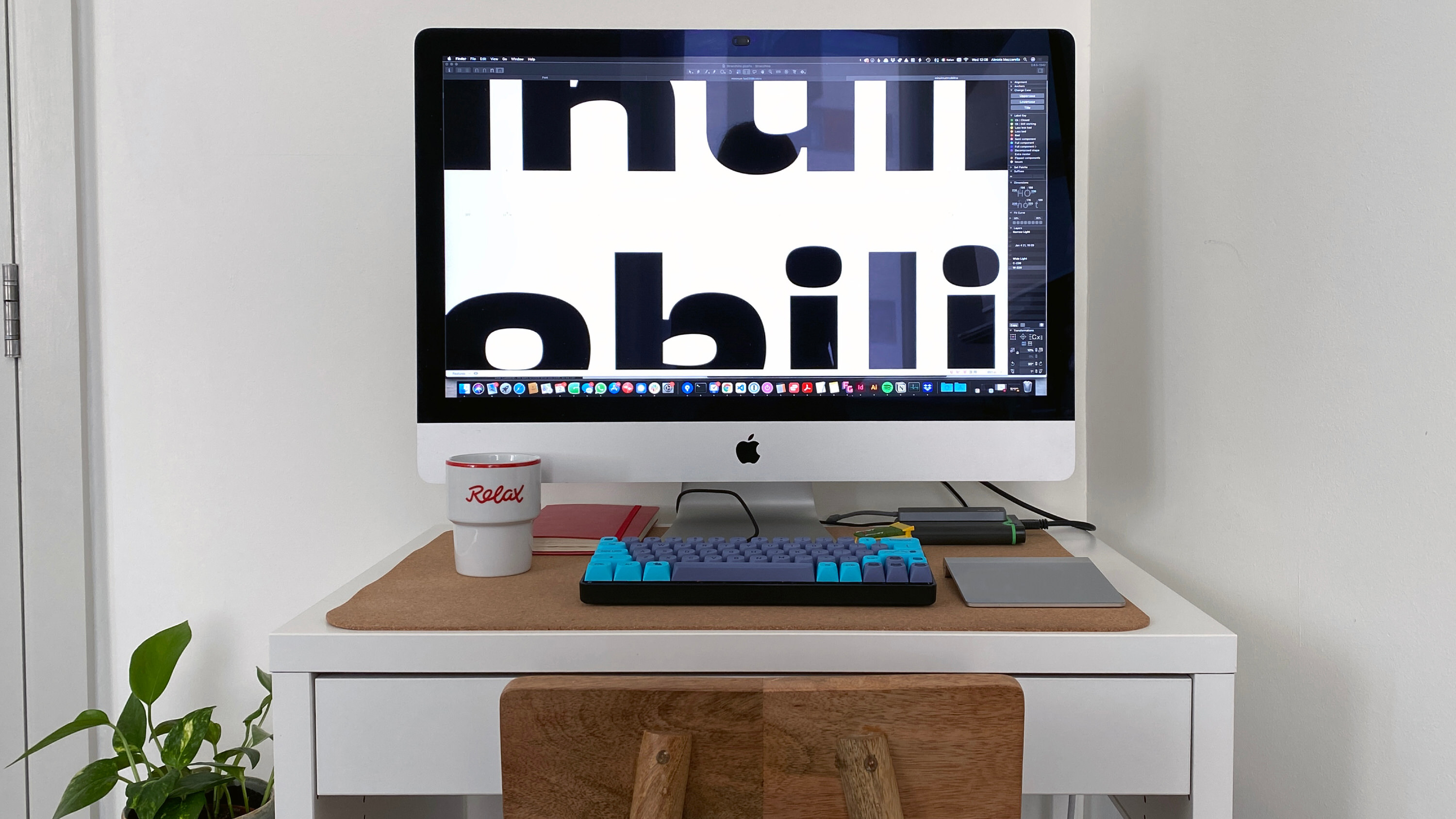
Guided by a structural idea or a detail she wants to explore or a specific feeling she wants the typeface to have, Alessia ditches the sketchbook for exploring directly in the font editor. “I often think of letters as movements or gestures, and then try to understand how the outline would wrap around that movement.” Sometimes inspiration comes from observing movement in the world—a gesture, a bend, a shift in weight—and imagining how an outline might wrap around it.
Once a rough proof emerges, she defines the scope. Is this an expressive one-off display face or the seed of a multi-weight family? She focuses early on the defining weights and the features that give the typeface its voice.
When the design stabilizes, she exits the mindset of “type designer” and begins testing it in the real world. It appears in documents, teaching materials, and any setting where the type needs to perform quietly and confidently. “It’s the moment where I check whether the letterforms behave well alongside other content,” she explains, “and whether anything still feels distracting or unresolved.”
Typeland: A studio built on collaboration and curiosity
Typeland began as a simple portfolio necessity. A place to share type work separate from her graphic design projects after completing the MA in Typeface Design at the University of Reading.
Together with her partner, Vaibhav Singh, it quickly developed into a full-fledged studio. Since 2020, it has grown into a practice that publishes its own retail type library and takes on custom type and multi-script projects, with special expertise in Indic scripts and large pan-Indic systems. Working on projects like the Indian-script companions of Proxima Nova, their work sits at the intersection of research and practice across multiple languages.
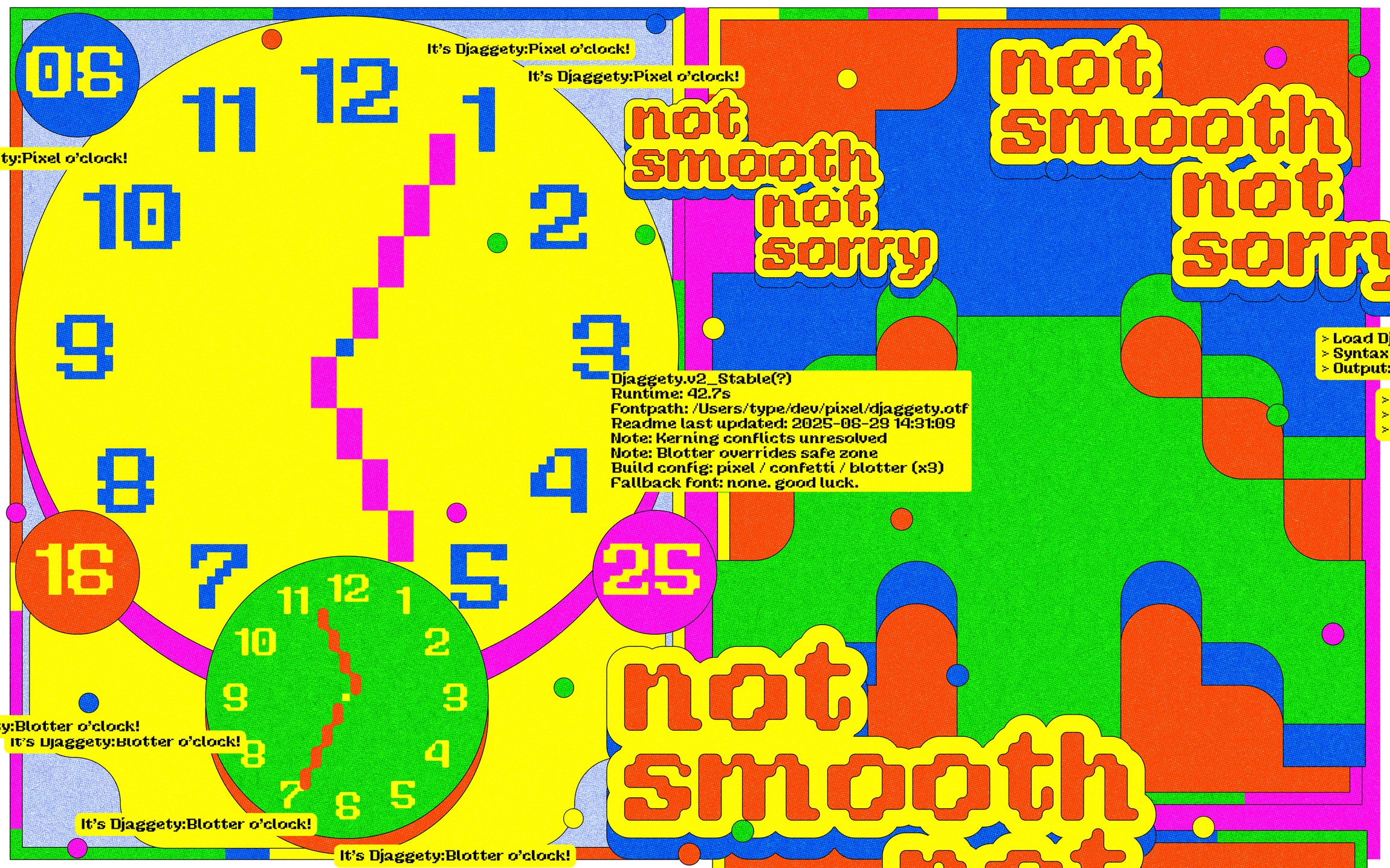
One of their latest releases, Djaggety, is a pixel font that exemplifies Alessia’s process by beginning life in the classroom as a teaching tool. Its motto of less finessing, more accepting, embodies the human-centered approach to Typeland’s voice in type design.
Vernacular sources that inspire
While historical specimens and canonical references remain part of her research, much of her inspiration comes from the vernacular. She gravitates toward cemetery inscriptions, especially in small Italian towns where hand-carved or metal letters reveal idiosyncratic quirks.
…it is often those imperfect, very local bits of lettering that stay with me.
She’s equally drawn to aging shopfronts and vinyl-cut signage that has warped, peeled, or been patched over. Imperfection, she argues, often carries the clues that make letterforms compelling. Wood type specimens, with their scale shifts and color play, echo this spirited irregularity and remain a favorite reference point.
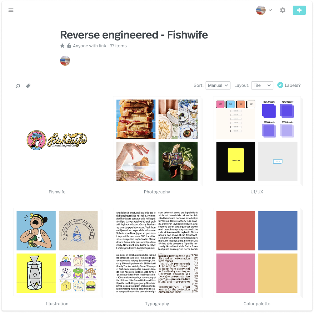
How Dropmark helps make sense of a chaotic camera roll
Like many designers, she relies on her camera roll to capture anything that sparks an idea, but the results can become unruly fast.
“I constantly take photos of things that catch my eye, then later I have no idea why a particular image felt important,” she says. Dropmark gives that impulse a loose but meaningful structure. Broad collections like color, packaging, signage, and layouts help her corral screenshots and photos into references actually worth revisiting.
On letters that delight (or don’t)
Ask her for a favorite letter, and she doesn’t hesitate: the “s.”
A successful “s” demands negotiation. It’s one of the most structurally revealing letters in any typeface. “It’s not enjoyable while I’m working on it,” she admits, “but when it finally clicks and sits comfortably with its neighboring letters, it’s very satisfying.”
There’s also a solid list of letters she doesn’t enjoy drawing (which her friends know well), but those remain off the record. In general, she loves letters that carry structural weight within a word, acting almost as proof of whether the typeface’s core idea is truly holding together.
A mundane archive with surprising charms
Asked what she’s Dropmarked recently, she mentions something wonderfully ordinary: supermarket own-brand packaging. Supermarkets craft internal visual languages to distinguish product tiers, often with surprisingly sharp typography or clever logos hiding in plain sight.
“It feels like a very mundane archive,” she says, “but it’s a good reminder that interesting design decisions are present in the most ordinary of contexts.”
Thanks so much to Alessia for chatting with us! Check out more of her work at her website, and check out more of Typeland or follow them on Instagram and Mastodon.